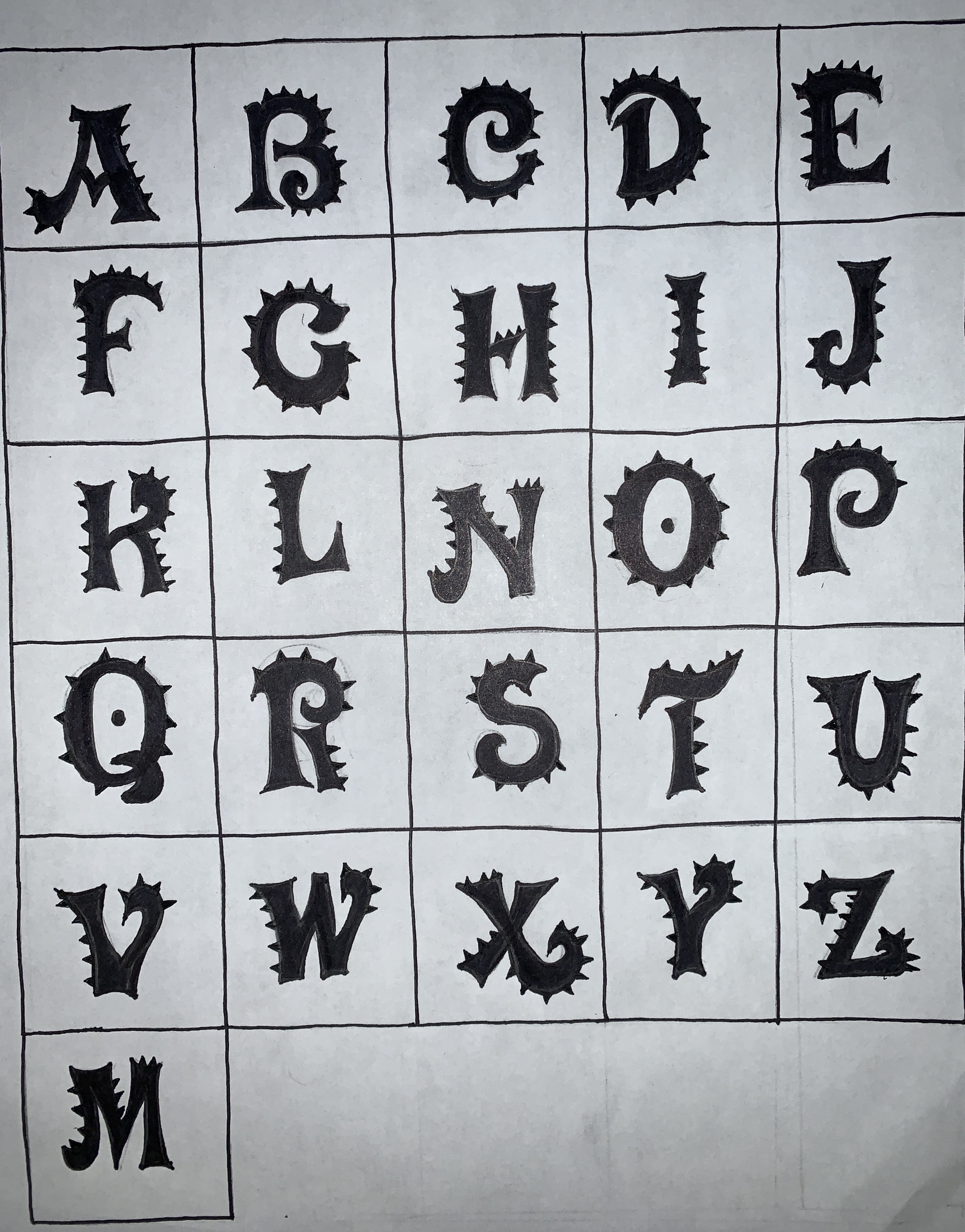
After soaking in the feedback we got from our peers and reflecting on the final draft of our previous font, Industrial, we had a realization: we need to find a way to bring elements of steam punk together with elements of the Victorian Era to bring our font to the next level. Before we show you our final draft, we would like to reiterate that our audience are young females, around the ages of 5-9, which is prime reading time! Our purpose was to create a font to fit with the steam punk aspect of the popup book, but also appeal to the young girls reading the book. With this in mind, the following is our final font which we cleverly named, Victorian Punk.
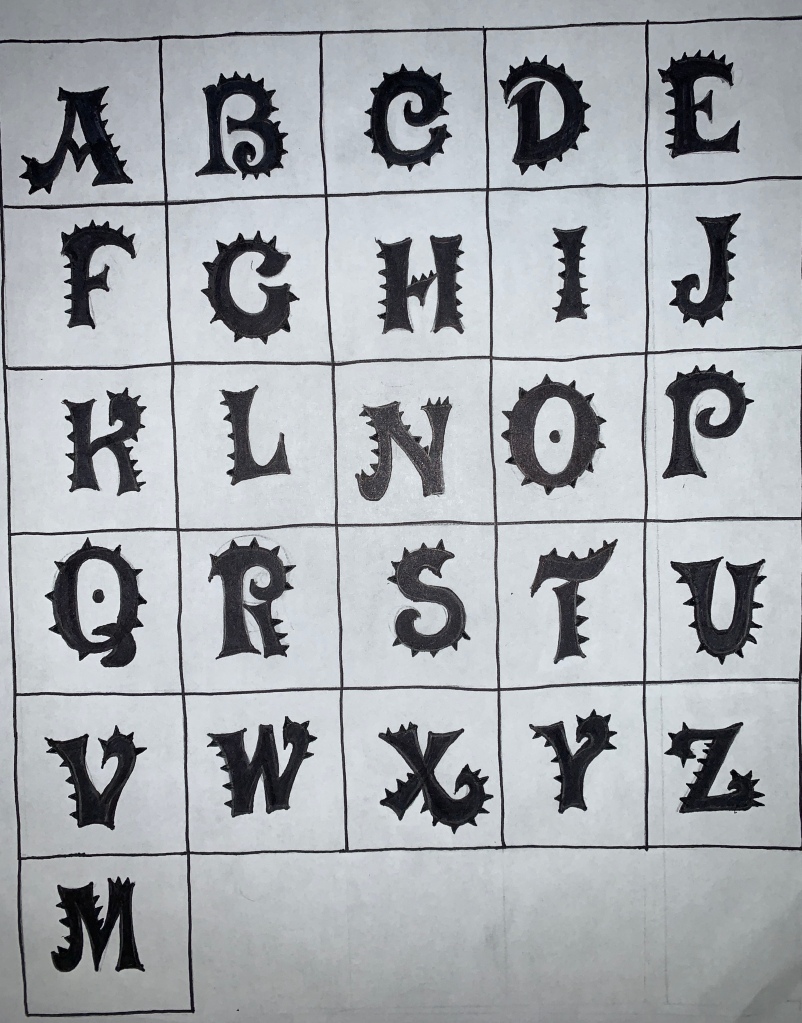
As you can probably tell, we added some spikes to the edges of our font which was in hopes of emulating the spikes seen on gears. We didn’t want to be cliche with the gears, so we took some inspiration from the gear and twisted it a little to fit with our, originally Victorian, font. The spikes are not perfect and neither are the letters which give the font a built and organic feel which relates to Athena as she builds a ships herself to escape from the castle. We hope that by combing the Victorian aspect with the Steampunk aspect, the targeted audience would be drawn to the book by just the title. We also kept the thickness of the font to add to the industrial side of the font.
*While our font is shown here in black, we think it would look great in white on the cover!
Our Font From Beginning to End
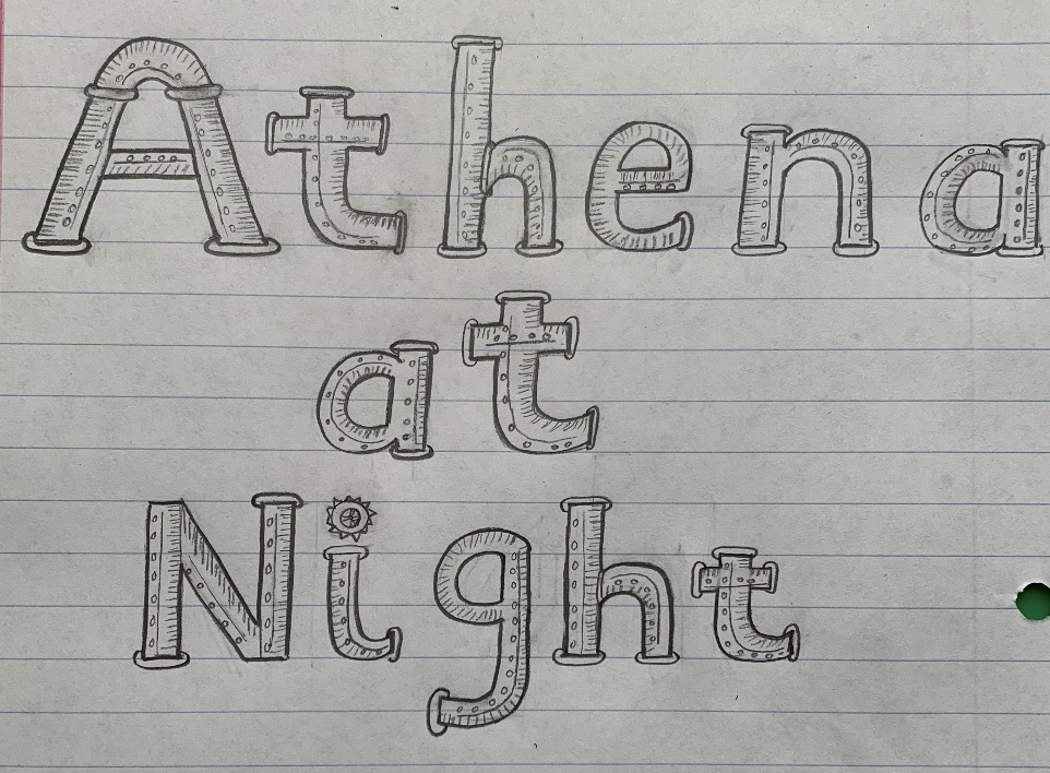


Personally, I feel that each of these fonts has its pros and cons. Each could be a font something entirely different, but in many ways each one has similar qualities to the other. Our final font is the best of both worlds in way and we feel that it really encapsulates Athena at Night because of the feminine side of the font with the curvature, but also brings in the industrial feel with the spikes and thickness of the font.
Your Thoughts!
Please let us know you insights on our font! We worked hard on it and would love your feedback. Some things to think about:
Did you like the combination of the Victorian elements with the Steampunk elements?
Do you feel that our iterations show improvement from beginning to end?
Which font was your favorite?

I like how your post really shows the iterations you went through and highlights the shift from industrial to Victorian. I preferred the font before this draft, just because the gear spikes feel a bit too rounded and come across more like spikes than anything else. This could be fixed by just putting the spikes on the portions of letters that have a distinct curve (like the top of the F or basically all of the G). Regardless, your font came out really nice!
LikeLike
I really love your final font! I also liked the slide show you made to see how your font has evolved. I like the combination of steampunk and Victorian elements, I think they work very well together. My favorite font was the last font because it was simple and legible yet very interesting to look at!
LikeLike
I love your final design! That was a great idea to incorporate the spikes as a more ‘gear-like’ feel but without the gears. I also really like the gallery at the end showing your progression from the first draft to now.
LikeLike
I love the slideshow of beginning to end it really helps to show your process through this and how you overcame challenges! I do like the last one because of the spikes you added. I think it adds a bit more to the design to make it stand out.
LikeLike
I think this version of your font does a great job at combining the elements of steampunk and Victorian styles, as well as appealing to your audience. I also think all the versions of your font show a clear thought process, and it evolved quite nicely!
LikeLike