After presenting our final draft in class, we received some great feedback on our new font! While some thought liked our first draft more than the second, we are happy with how it came out.


While some thought that our final draft was very spiky and looked too menacing, Karen pointed out that Athena at Night was inspired by Sleeping Beauty. In Sleeping Beauty, Aurora gets the spell cast on her by pricking her finger on a sharp needle.
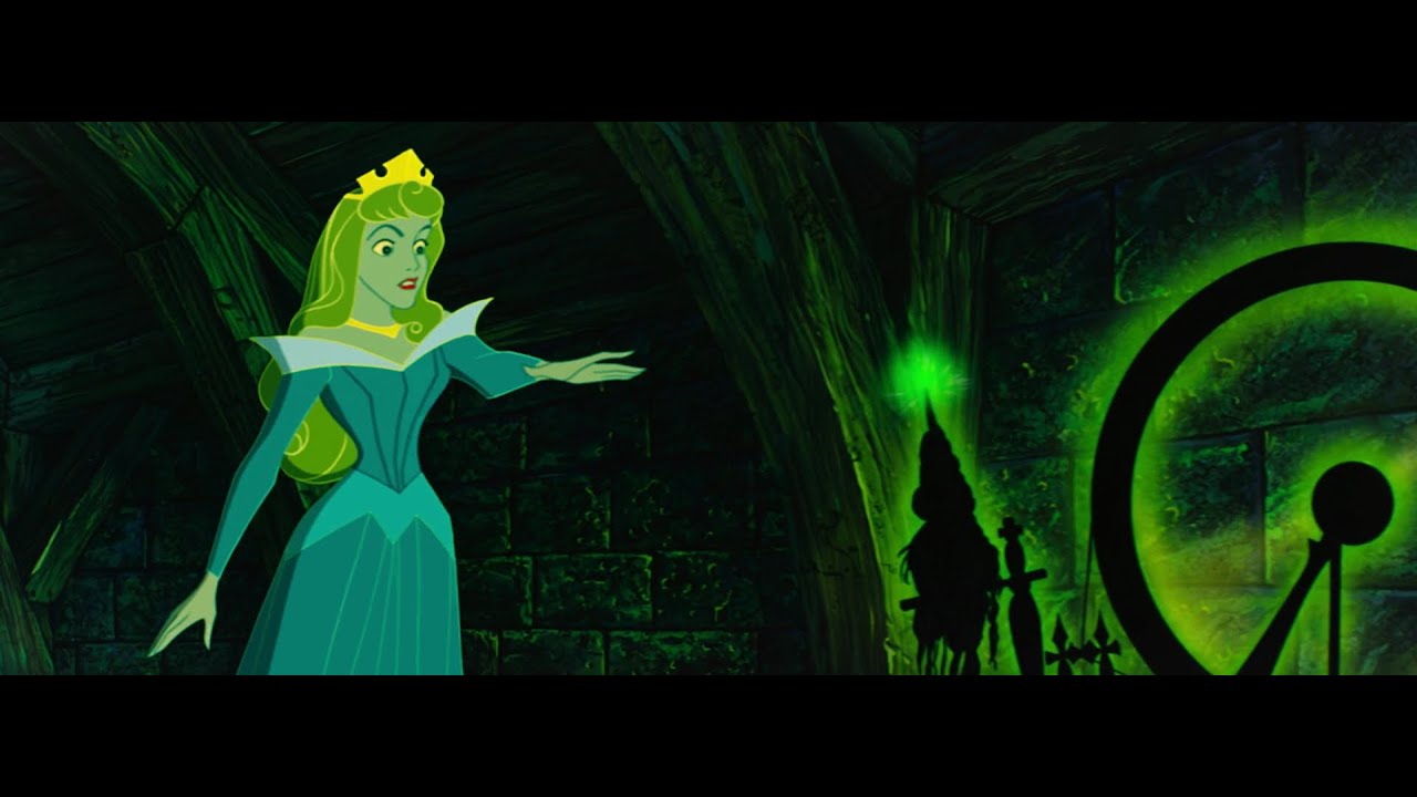
Check out the original plot of Sleeping Beauty here !
Additionally, we can see sharp and jagged edges on the final page of the book, where Athena breaks through the stain glass.

These are two points that we didn’t see in creating our font originally, but we were glad that our client could relate our font to the story so well!
She also mentioned that she may use the first draft of our font (without the spikes) on the story cards! Even though we did not get selected for the title font the first time around, we are excited to hear that our font may still appear in the book!
Overall, it was really great to work with everyone in this class. You all have amazing ideas and talents, and it was super fun to see how many iterations of the same project were made.
Good luck on finals and have a great spring break!
-Nicole and Nupur

your final product came out wonderfully, as discussed in class that balance between the Victorian era really came through in your new font. personally, i thin k the non-spikey version fits this story a little better although the effort and time you put into your final product really pulls through! I hope they end up using it in the action page like karen mentioned
LikeLike
Thanks Eddie! I actually agree that I like our first draft of the font more; however, we wanted to make sure that Professor deWinter knew that were thinking that our font had to relate to the project requirements in a rhetorical way. It felt like adding the spikes/gears was necessary in order to justify that our font was steampunk.
LikeLike
I think this font looks SICK. Totally reminds me of a fairy tail or Disney princess type movie. I do think though that the spikes give off a very evil, ominous look. As if that font was Maleficent’s font. However, the first rendition without the spikes look like it would be Auroras. You get where I’m going with that? This is such a great design and execution of it was so clean. Really really good work guys.
LikeLike